Rare Cookies
standard identity design
Rare serves up delicious cookies with a unique twist. How would you like your cookie? Well done, medium or rare. With a brand that lets you customize highly unique cookie creations, they knew it was vital to have a cohesive brand identity to represent themselves clearly so we moved into this project excited to create something special.
Strategy Overview
how we win hearts
brand substance
Vision : To find escape from a cookie cutter world.
Mission : Creating cookies as rare as you.
audience
Karissa was our key audience model. She's living a busy life and trying to find herself. Her main desire is to seek out new, fun experiences that make her feel excited but ultimately her time and options are limited.
positioning
Rare sets themselves apart with their unique product but beyond that, they focus on an outstanding customer experience and also lean into genuine human personality rather than a distant corporate entity.
personality
The personality of Rare is informal and warm and would appear as a friendly, funny, and upbeat friend.
Visual Identity


logo & color palette
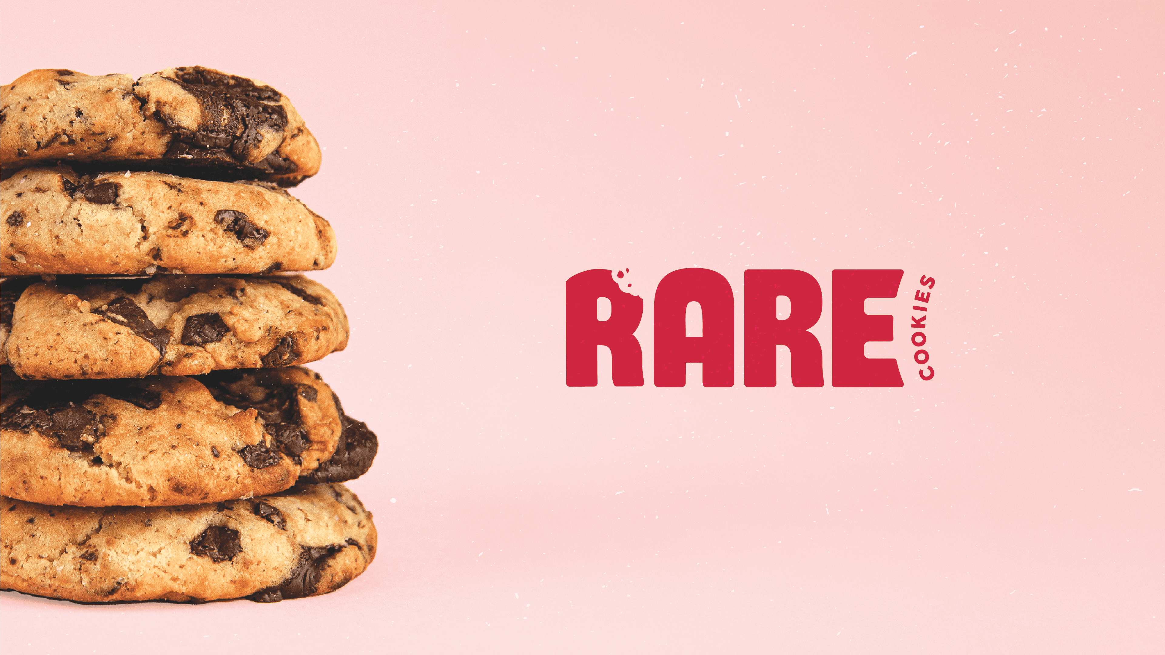
Our logo direction shows excitement and fun through the bold condensed lettering which has been customized to be fully unique to Rare. With a bit being taken out of the R, it creates a fully custom design that translates to multiple variations easily. The color palette has a bold alterness and freshness simultaneously as it pairs a deep red with a teal blue.


brand icons
Our icons mimic the same fun we have in the rest of the design with slightly roughened styling to have an imperfect feel. We portray product-relevant imagery and personality-centered icons that can be used in a variety of ways.


surface pattern
A scattered layout fits into a unified pattern that incorporates brand icons as well as various toppings. A more free-flowing design here meshes well with the upbeat and casual presence we want in Rare.
Ready to uncover your perfect brand?
we can create something just as special as this. reach out and let's chat
LET'S WORK TOGETHER


Rare Cookies
standard identity design
Rare serves up delicious cookies with a unique twist. How would you like your cookie? Well done, medium or rare. With a brand that lets you customize highly unique cookie creations, they knew it was vital to have a cohesive brand identity to represent themselves clearly so we moved into this project excited to create something special.
Strategy Overview
how we win hearts
brand substance
Vision : To find escape from a cookie cutter world.
Mission : Creating cookies as rare as you.
audience
Karissa was our key audience model. She's living a busy life and trying to find herself. Her main desire is to seek out new, fun experiences that make her feel excited but ultimately her time and options are limited.
positioning
Rare sets themselves apart with their unique product but beyond that, they focus on an outstanding customer experience and also lean into genuine human personality rather than a distant corporate entity.
personality
The personality of Rare is informal and warm and would appear as a friendly, funny, and upbeat friend.
Visual Identity
logo & color palette
Our logo direction shows excitement and fun through the bold condensed lettering which has been customized to be fully unique to Rare. With a bit being taken out of the R, it creates a fully custom design that translates to multiple variations easily. The color palette has a bold alterness and freshness simultaneously as it pairs a deep red with a teal blue.
brand icons
Our icons mimic the same fun we have in the rest of the design with slightly roughened styling to have an imperfect feel. We portray product-relevant imagery and personality-centered icons that can be used in a variety of ways.
surface pattern
A scattered layout fits into a unified pattern that incorporates brand icons as well as various toppings. A more free-flowing design here meshes well with the upbeat and casual presence we want in Rare.
Ready to uncover your perfect brand?
we can create something just as special as this. reach out and let's chat
LET'S WORK TOGETHER
Rare Cookies
standard identity design
Rare serves up delicious cookies with a unique twist. How would you like your cookie? Well done, medium or rare. With a brand that lets you customize highly unique cookie creations, they knew it was vital to have a cohesive brand identity to represent themselves clearly so we moved into this project excited to create something special.
Strategy Overview
how we win hearts
brand substance
Vision : To find escape from a cookie cutter world.
Mission : Creating cookies as rare as you.
audience
Karissa was our key audience model. She's living a busy life and trying to find herself. Her main desire is to seek out new, fun experiences that make her feel excited but ultimately her time and options are limited.
positioning
Rare sets themselves apart with their unique product but beyond that, they focus on an outstanding customer experience and also lean into genuine human personality rather than a distant corporate entity.
personality
The personality of Rare is informal and warm and would appear as a friendly, funny, and upbeat friend.
Visual Identity
logo & color palette
Our logo direction shows excitement and fun through the bold condensed lettering which has been customized to be fully unique to Rare. With a bit being taken out of the R, it creates a fully custom design that translates to multiple variations easily. The color palette has a bold alterness and freshness simultaneously as it pairs a deep red with a teal blue.
brand icons
Our icons mimic the same fun we have in the rest of the design with slightly roughened styling to have an imperfect feel. We portray product-relevant imagery and personality-centered icons that can be used in a variety of ways.