Otay
standard identity design
Otay was founded by parents who had a passion to bring the support of a village to the parents around them. Their app makes matching with a safe, reliable babysitter easy and consistent. We strategized built a brand that sets the tone for this relationship.
Strategy Overview
how we win hearts
brand substance
Vision : Helping parents experience the freedom that comes with a village
Mission : Being a simple and reliable babysitter hub for parents
audience
Kate, a mom of 3, was who Otay was focused on serving. She is in need of babysitting fairly often but her current options fall short and she fears falling short in her parenting so she is eager for the support she needs.
positioning
The difference Otay holds is in their modern systems, control in the experience, affordability, and community-centered approach.
personality
For our personality, we narrowed our focus on three key traits that would support what Otay needs to communicate: caring, pure, and casual.
Visual Identity
logo & color palette
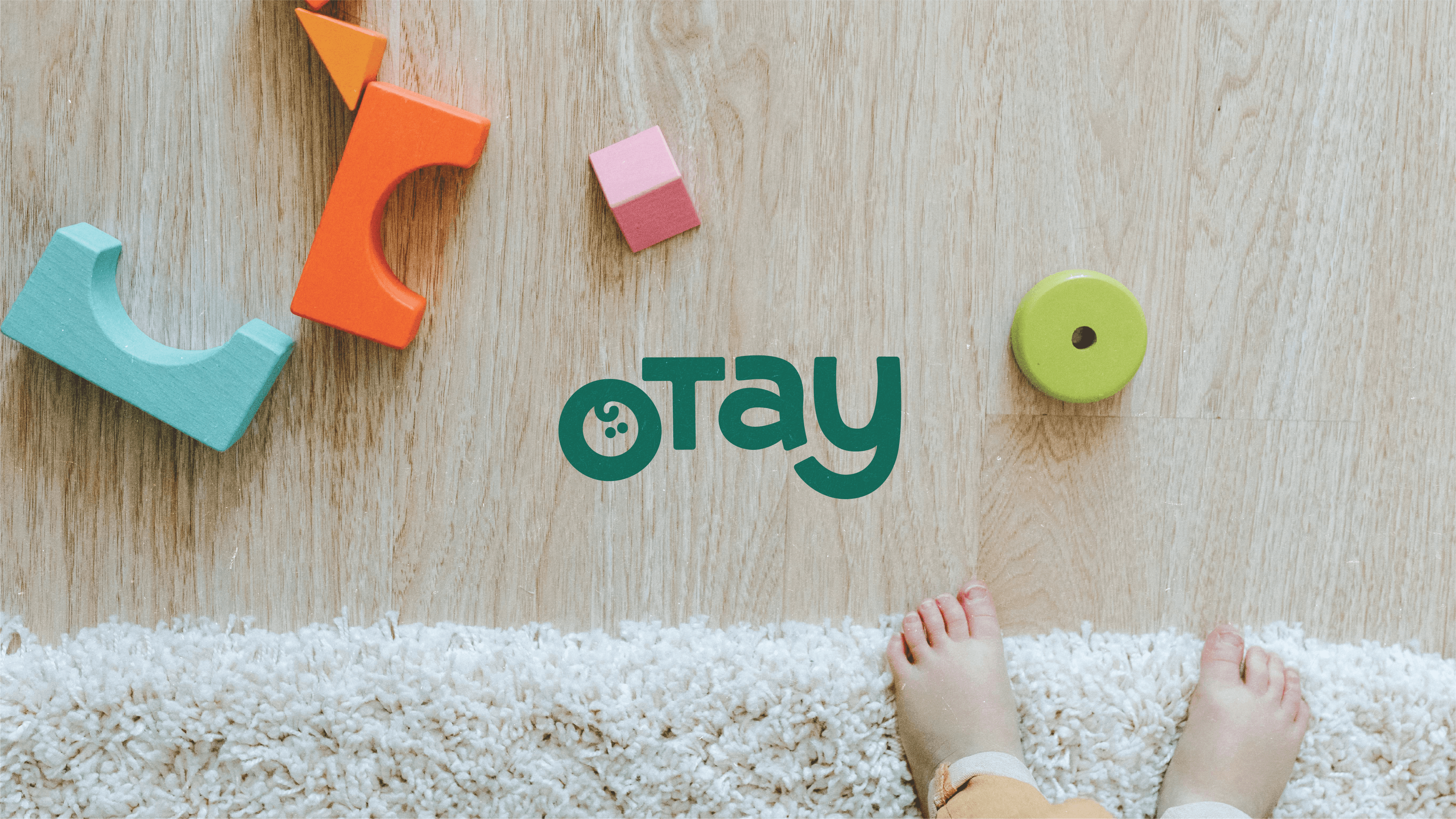
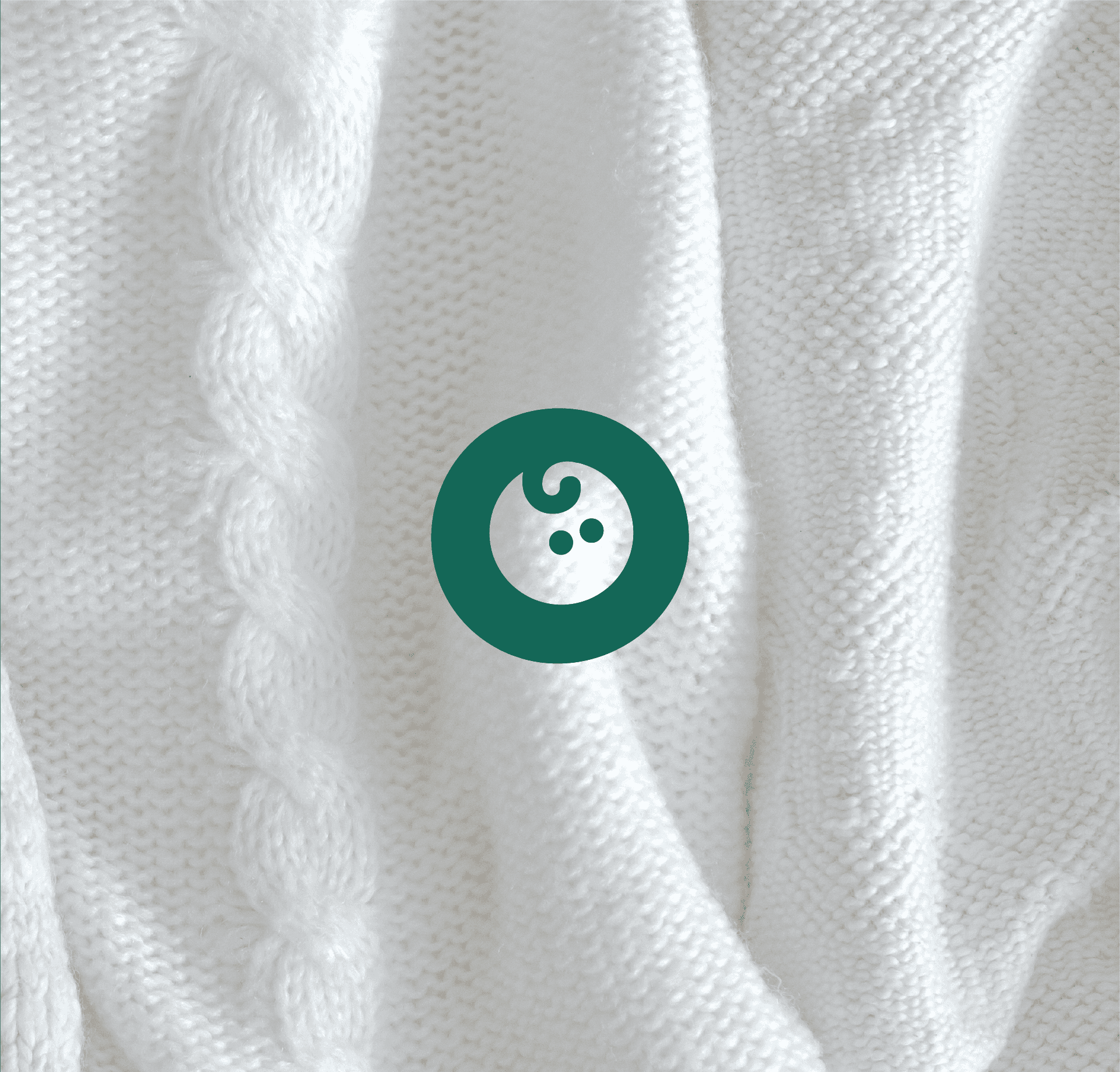
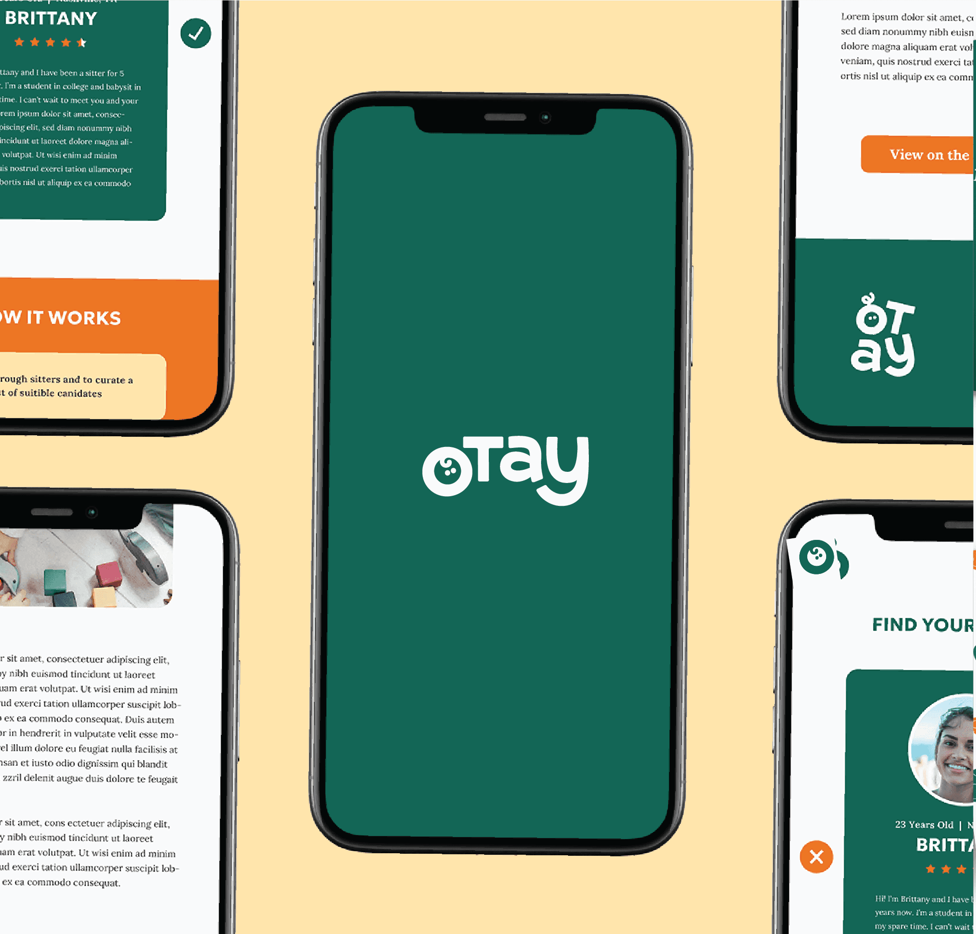
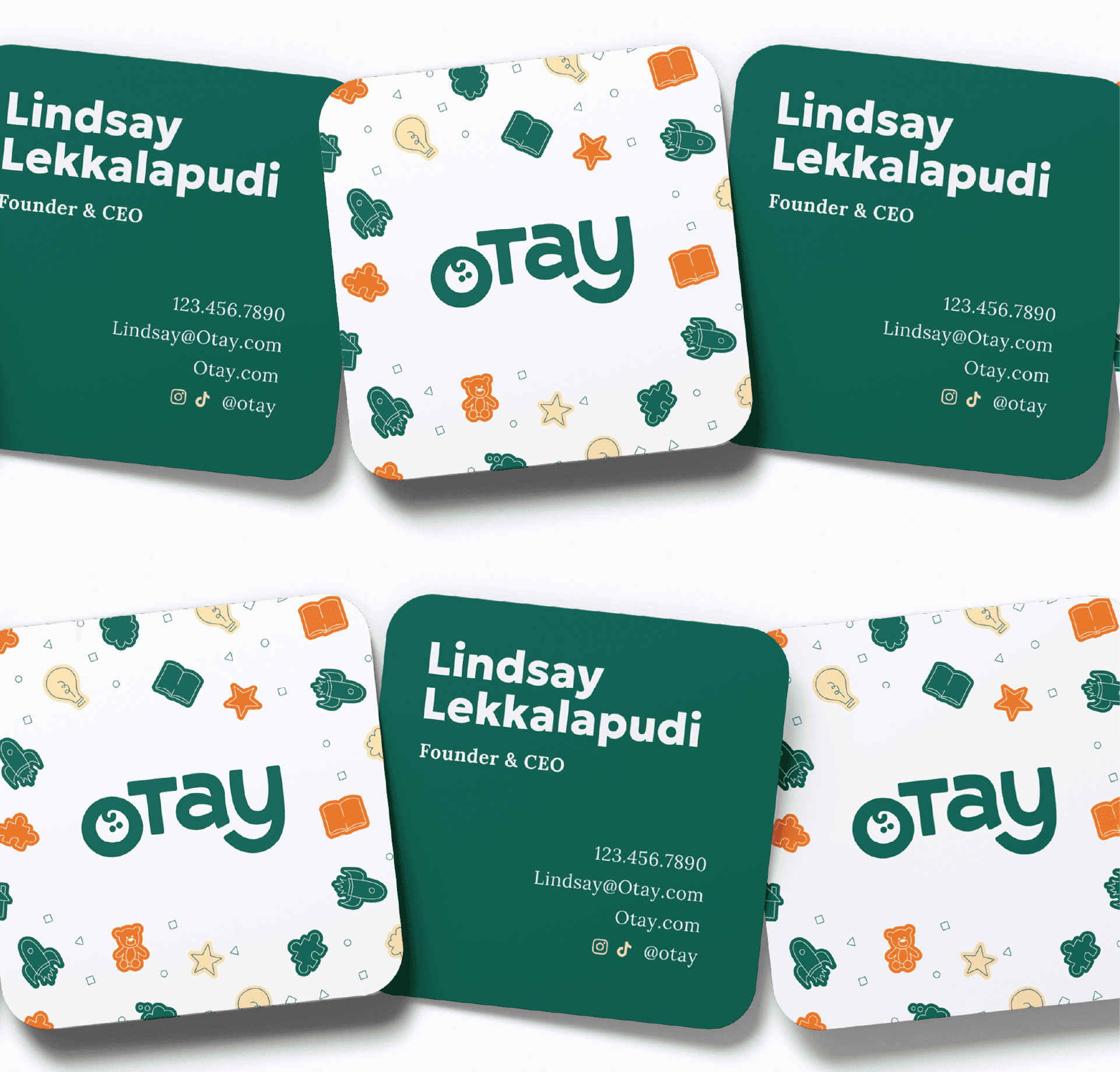
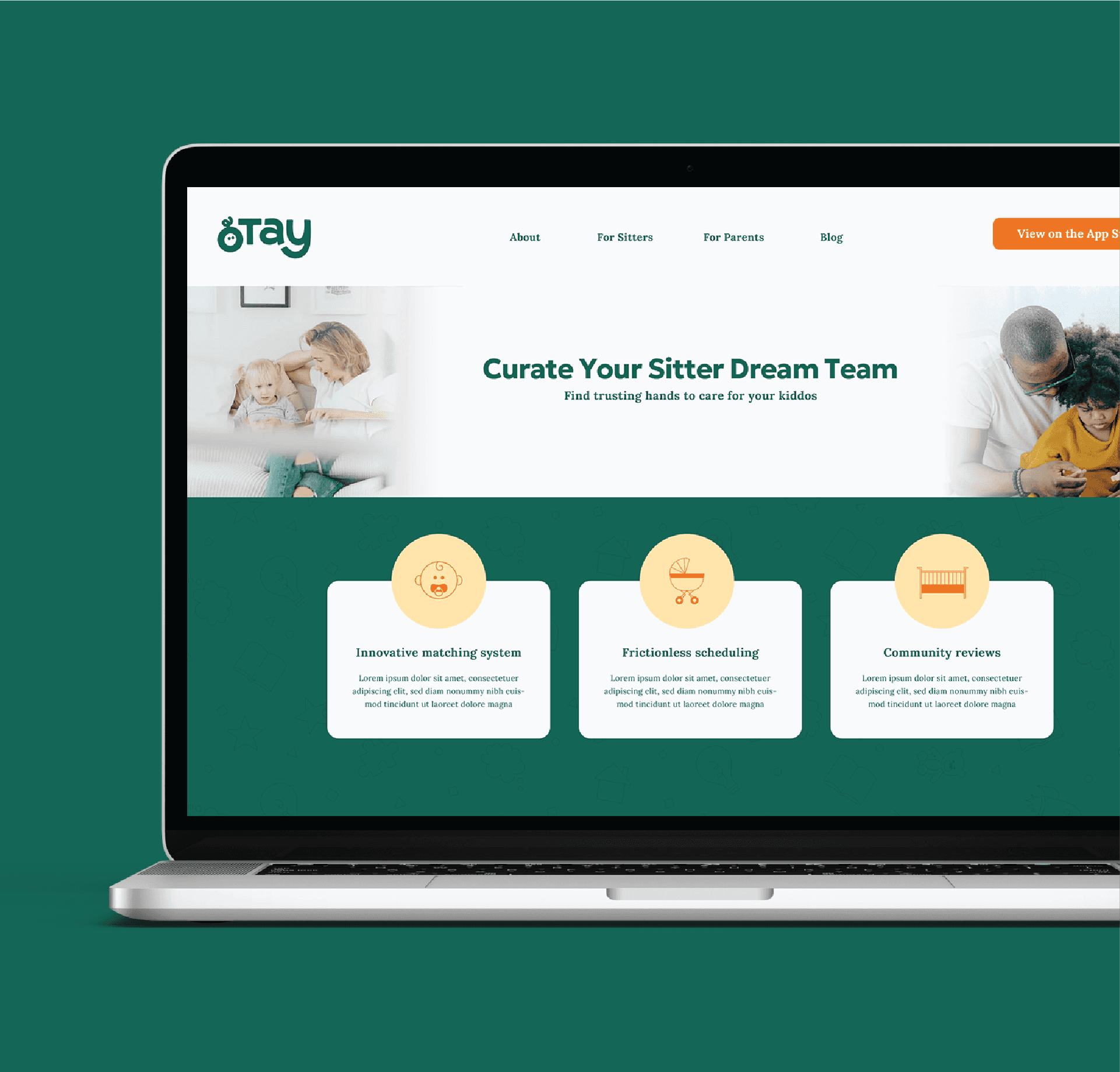
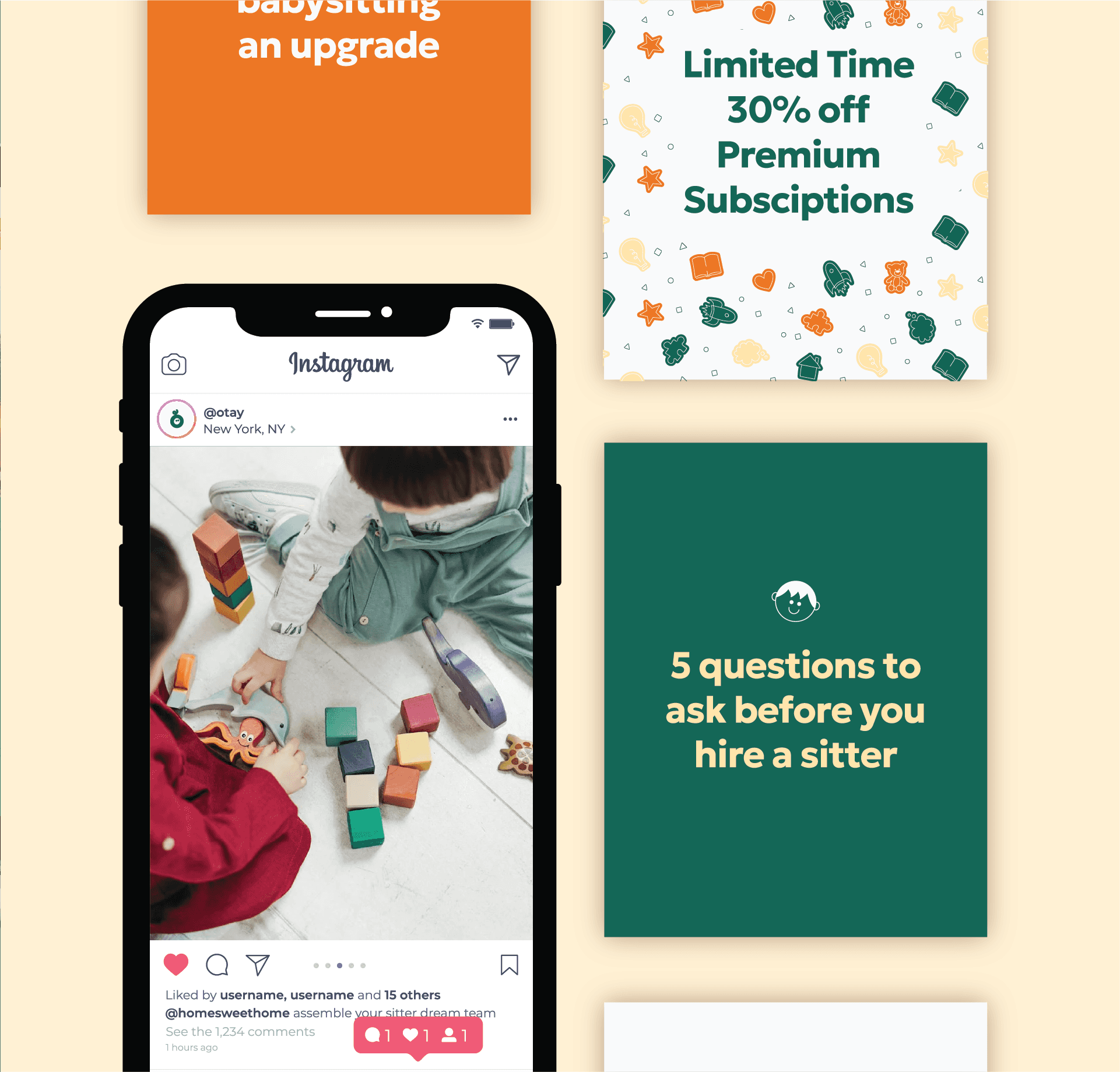
The logo needed to hold a softness to it and simplicity. We designed custom lettering that uniquely flows together and we created a very simple, recognizable mark from the O with a child's face. Our color palette focuses on a refreshing green at the forefront that has a contrasting orange and soft yellow to support it.
brand icons
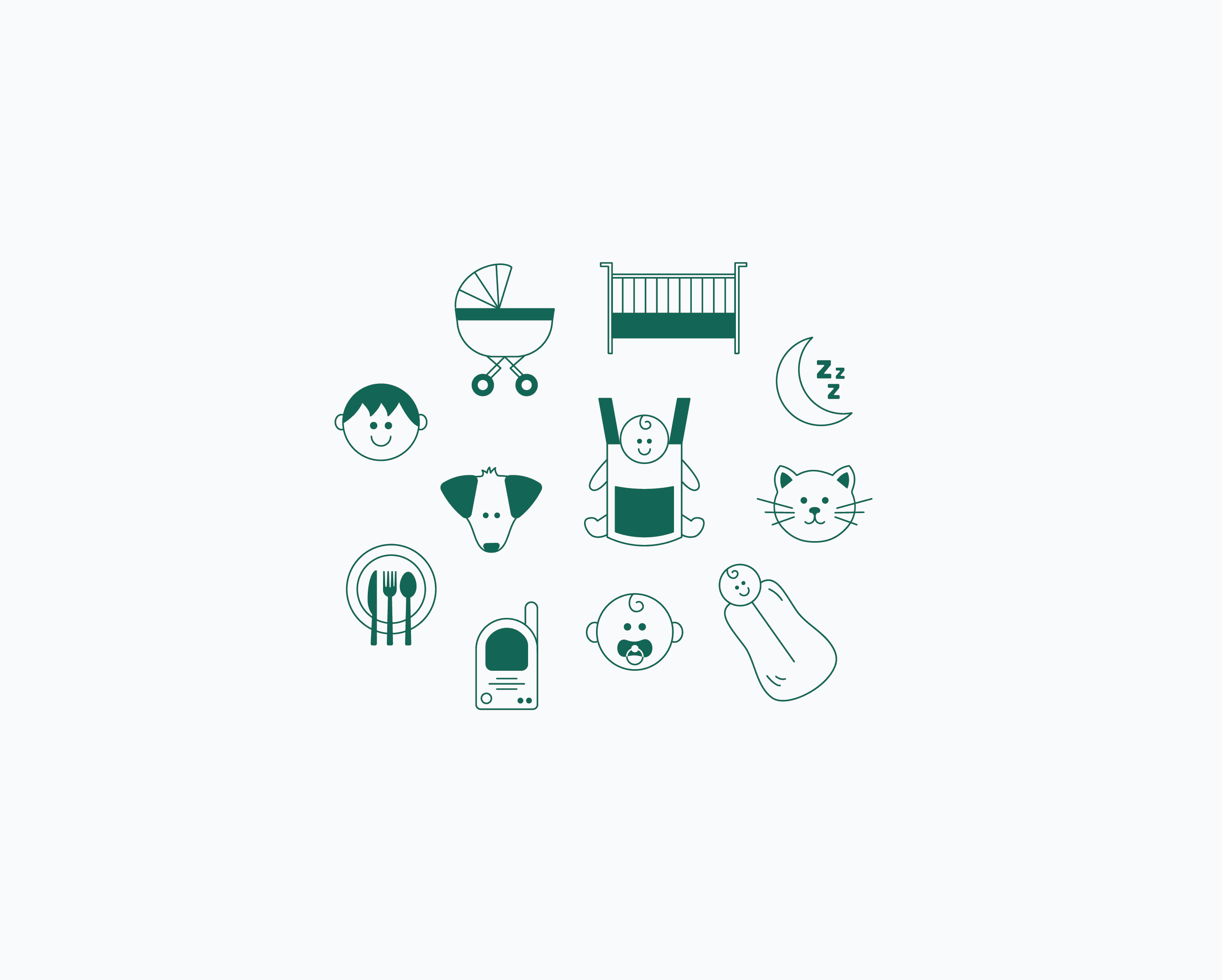
Bringing the same soft, friendly feel into our custom illustrations, we focused on a variety of images that use light line work and simple, soft designs.
surface pattern
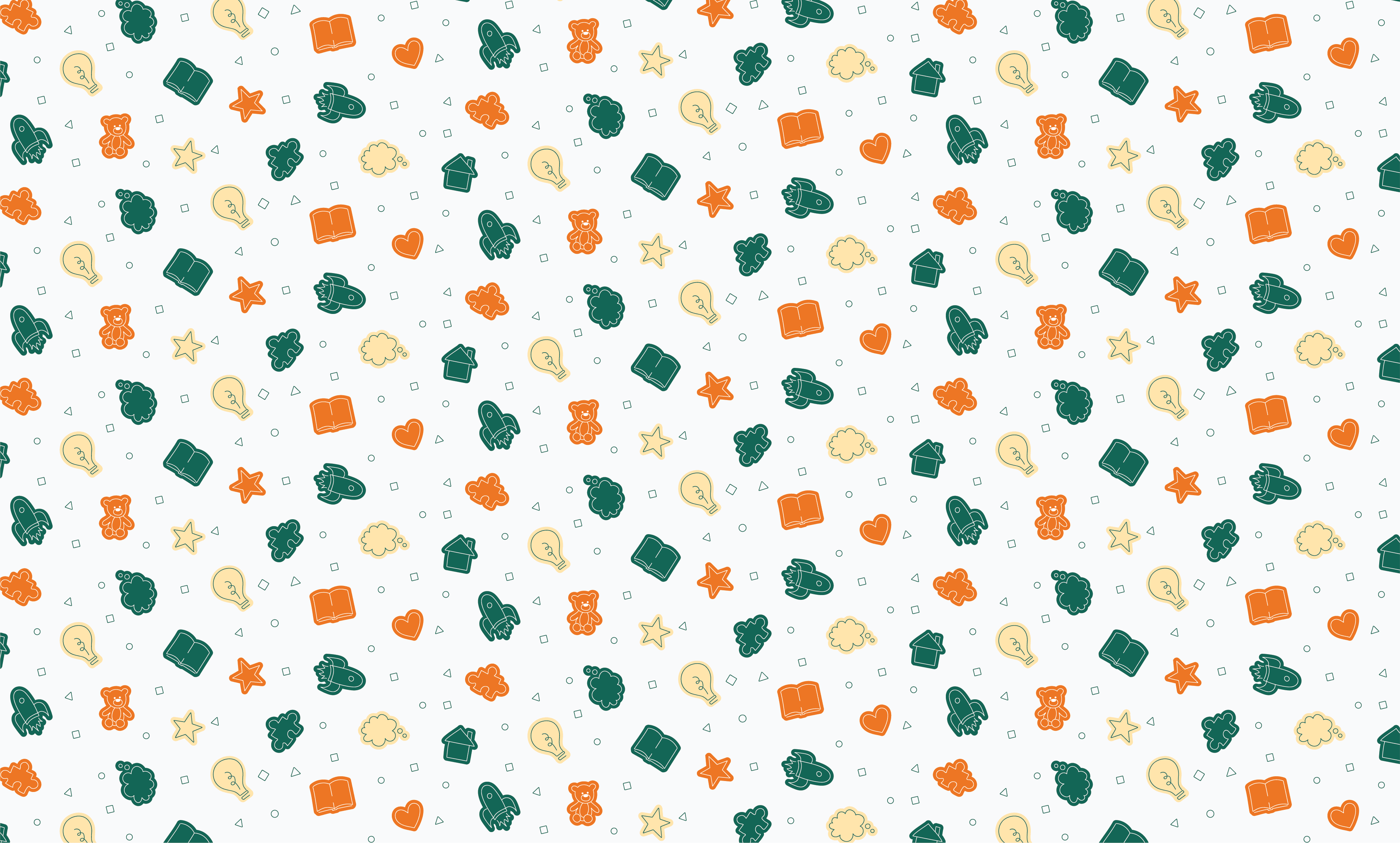
Our pattern brings in child-like illustrations on a variety of colors to further capture a pure, welcoming presence that Otay is seeking.
Ready to uncover your perfect brand?
we can create something just as special as this. reach out and let's chat
LET'S WORK TOGETHER


Otay
standard identity design
Otay was founded by parents who had a passion to bring the support of a village to the parents around them. Their app makes matching with a safe, reliable babysitter easy and consistent. We strategized built a brand that sets the tone for this relationship.
Strategy Overview
how we win hearts
brand substance
Vision : Helping parents experience the freedom that comes with a village
Mission : Being a simple and reliable babysitter hub for parents
audience
Kate, a mom of 3, was who Otay was focused on serving. She is in need of babysitting fairly often but her current options fall short and she fears falling short in her parenting so she is eager for the support she needs.
positioning
The difference Otay holds is in their modern systems, control in the experience, affordability, and community-centered approach.
personality
For our personality, we narrowed our focus on three key traits that would support what Otay needs to communicate: caring, pure, and casual.
Visual Identity
logo & color palette
The logo needed to hold a softness to it and simplicity. We designed custom lettering that uniquely flows together and we created a very simple, recognizable mark from the O with a child's face. Our color palette focuses on a refreshing green at the forefront that has a contrasting orange and soft yellow to support it.
brand icons
Bringing the same soft, friendly feel into our custom illustrations, we focused on a variety of images that use light line work and simple, soft designs.
surface pattern
Our pattern brings in child-like illustrations on a variety of colors to further capture a pure, welcoming presence that Otay is seeking.
Ready to uncover your perfect brand?
we can create something just as special as this. reach out and let's chat
LET'S WORK TOGETHER
Otay
standard identity design
Otay was founded by parents who had a passion to bring the support of a village to the parents around them. Their app makes matching with a safe, reliable babysitter easy and consistent. We strategized built a brand that sets the tone for this relationship.
Strategy Overview
how we win hearts
brand substance
Vision : Helping parents experience the freedom that comes with a village
Mission : Being a simple and reliable babysitter hub for parents
audience
Kate, a mom of 3, was who Otay was focused on serving. She is in need of babysitting fairly often but her current options fall short and she fears falling short in her parenting so she is eager for the support she needs.
positioning
The difference Otay holds is in their modern systems, control in the experience, affordability, and community-centered approach.
personality
For our personality, we narrowed our focus on three key traits that would support what Otay needs to communicate: caring, pure, and casual.
Visual Identity
logo & color palette
The logo needed to hold a softness to it and simplicity. We designed custom lettering that uniquely flows together and we created a very simple, recognizable mark from the O with a child's face. Our color palette focuses on a refreshing green at the forefront that has a contrasting orange and soft yellow to support it.
brand icons
Bringing the same soft, friendly feel into our custom illustrations, we focused on a variety of images that use light line work and simple, soft designs.